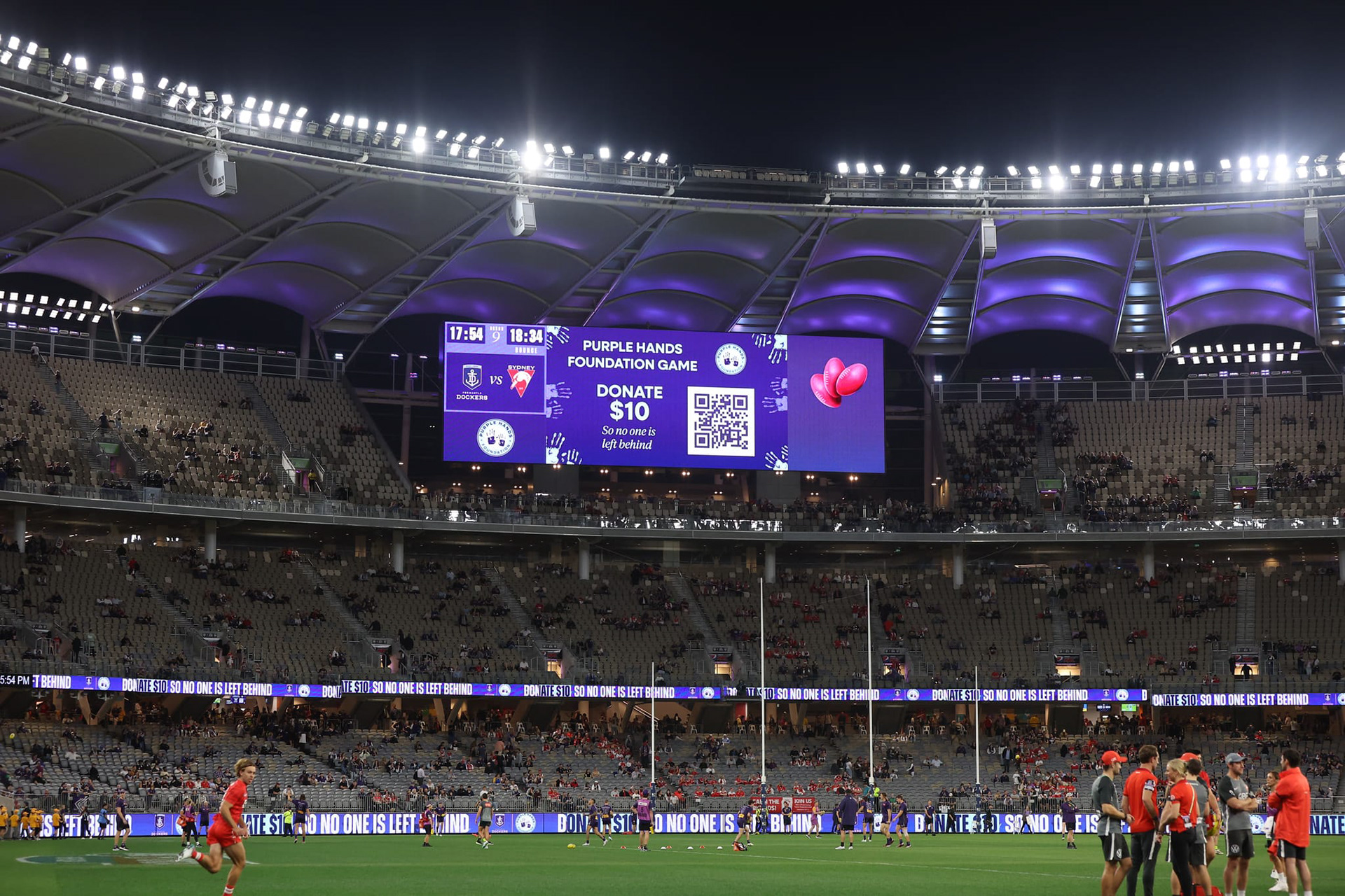
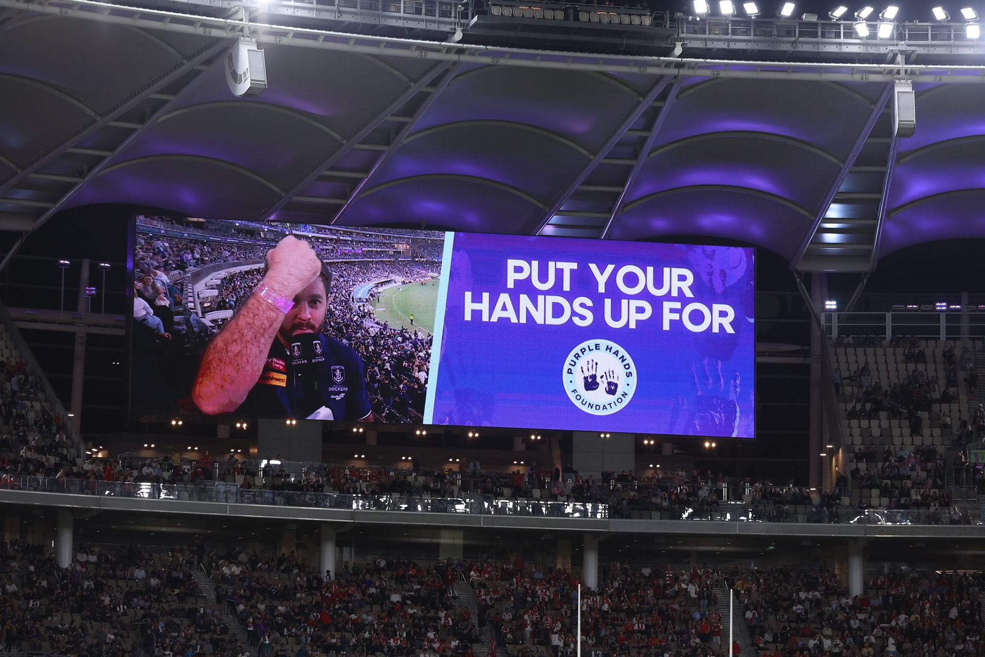
Brief: To introduce an additional brand colour to the Fremantle Dockers charity organisation; the Purple Hands Foundation.
Purpose: To create more of a brand identify to differentiate from the Dockers brand, while also creating a strong link relating to the amazing work they do across Western Australia, helping children from disadvantaged backgrounds.
Outcome: The new turquoise blue was introduced alongside the Dockers' purple. It's now utilised across all brand material for the Purple Hands Foundations, used in the logo, website, match day material, and all other digital and printed content.


